Before I got accessibility training at MadeCurious I always thought accessibility was hard to do. I thought I needed official training before incorporating it into my work and it would cost a lot of effort and time to do it. And if you have a little bit of imposter syndrome like me, you probably think you need to know all the things before you get started, otherwise you don’t feel “qualified” enough to do the work.
Well, it turns out this is not the case at all - accessibility isn’t rocket science 🚀. Adding a few easy-to-set-up processes to my daily work habits as a UX designer has already significantly improved my designs and made them more accessible.

Why accessibility is important 👀
I would argue that accessibility is a human right, it’s about designing products that are accessible to everybody. When products are designed to be accessible, they become more user-friendly for everyone, not just those with disabilities. Prioritising accessibility is not only a moral obligation, but also a smart business decision that leads to greater user satisfaction and a more successful product.
How cool is it to empower, for example, someone that can only use their voice to navigate a product, and make this seamless and easy for them? As an ethical designer, you try to be as empathic as possible. Accessibility is a big part of that.
There are broad access needs. We don’t just want to think about the voice-assisted technology user, we want to think about as many different things as we possibly can.
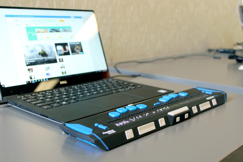
Here are some examples of the assistive and adaptive technology available:
- One-handed and low-vision keyboards
- Braille display
- Speech/voice recognition
- Mouth stick and head wand
Figuring out how to incorporate this in our mental models when we design or develop is really important.
So let’s start with the basics first.
What does accessibility mean? 🤷♀️
To me, accessibility means that people are not excluded from using something on the basis of experiencing a disability. Accessibility means that people can do what they need to do in a similar amount of time and effort as someone who does not have a disability. It means that people are empowered, can be independent, and will not be frustrated by something that is poorly designed or implemented.
Access needs can be permanent, temporary, and/or situational.
- Permanent: those who have a disability such as loss of limb, sight, hearing or speech.
- Temporary: when a person has a short-term injury or context that affects the way they interact for a short time. This includes wearing a cast or trying to browse in bright light where reflections can impact readability.
- Situational: when people move through different environments. For example in a large crowd people can’t hear well, in a car you’re visually impaired or if you’re a new parent, many tasks need to be completed while holding a baby.
I suspect that nearly everyone has fallen under at least one of these groups at some stage in their lives. I know I do it on a regular basis.

Accessibility and User Experience 👤
If you are doing any discovery work and creating user experience artefacts for your projects, consider adding in the following things for best practice:
- When you are creating personas, include a persona with a disability. This could be permanent (the persona has only 50% of their eyesight) or situational (the persona has a broken arm). This way you are automatically thinking about what this person needs in order to successfully interact with the product.
- When you are conducting user interviews, you could find participants with a disability so you get to understand their current struggles and issues with the product. You will gain a lot of insight into where you can improve the product significantly for this person.
- If you are conducting usability tests, consider including a persona who is 65+, or somebody who uses assistive technology like voice-over. It probably depends on the partner requirements, and an organisation like Access Advisors could help with finding the right person to test with.
Design tools for accessibility 🎨
I use a few different tools to make sure my designs are accessible:
- Contrast checker: I use a Figma plugin to check if all the colours that we use are accessible. There is also a great contrast checker online if you don’t use Figma: WCAG - Contrast Checker. This is how you ensure that there is enough contrast between the text and background to make it readable for everyone, including those with visual impairments. I normally aim for AA WCAG*.
- Focus State: When you are designing buttons, incorporate a focus state button as well. A focused state communicates when a user has highlighted an element using an input method such as a keyboard or voice. I usually add a border of 1 or 2 pixels around the button (with some padding between the button and the stroke).
- Keyboard-only navigation: Design with keyboard-only navigation in mind and how the user can navigate and interact with elements and content.
- Cognitive load: inclusive practices that remove barriers for people whose disabilities affect how they process information. Some examples include:
- Short paragraphs: Break up long paragraphs into shorter, more manageable chunks of text.
- Whitespace: Use whitespace to create a visual separation between elements on the page.
- Headings and subheadings: Use clear and descriptive headings and subheadings to help users understand the structure of the content.
- Avoid overusing animations or using them excessively in a way that becomes distracting or overwhelming. This can increase cognitive load and make it difficult for users to focus on the content.
- Zoom level: Ensure zoomed content (zoom level to ideally 400%) is still readable and usable. A well-designed and developed, responsive website will help with this as well.
Learn more about accessibility 📚
Sharing knowledge with your team and learning from each other is something I would highly recommend. Organising (regular) meeting(s) about accessibility and how to put it into practice is a great way to make more people aware of it, and you can grow and learn as a team and empower each other.
You can find a lot more information on the WCAG website, but the website can be a bit hard to navigate, that’s why I use this checklist to make sure I’m ticking all the boxes. You can apply different filters to the checklist and it’s really helpful to use when designing.
I can also encourage you to keep reading articles about accessibility and keep up to date with the latest technology. I can recommend this Smashing Magazine article about accessibility and I’m always looking for interesting articles on Medium.
Additionally, reaching out to experts like Access Advisors for Accessibility training can significantly boost your confidence in performing accessibility work. It has proven to be highly effective for us.
Together we can make the digital world more accessible for everyone 🦾
* At the time of writing, the Web Content Accessibility Guidelines (WCAG) 2.1 is the current web standard, containing 78 success criteria in total, with each one assigned a level. There are three levels in WCAG 2.1, Level A (the lowest level), Level AA, and Level AAA (the highest level). WCAG 2.2 is expected to be published as the new web standard in late 2023.


