Anyone who knows Media Suite, knows we take our work environment seriously. Not in the sense that everything must be (suitably serious) shades of grey, but in the sense that we know how our workplace can impact our people. The team and how they like to roll is always at the forefront of our minds.
Many will know that we moved offices around this time last year. Just a short walk from one end of our Ferrymead building to the other, but a significant one. We gained a truckload of space, a vastly improved layout, slick new aesthetics (complete with loud wallpaper and a new foosball table), a communal kitchen hub, and some breakout workspaces – just to name a few benefits. Read more about the move here.
We always planned to “live in the space” a while before making any further changes. For the most part, we wanted to really figure out how we wanted to use the space. Sometimes, it’s too tempting to rush in and plan how the space will be used, when the better approach is to wait and see how everyone does use the space, and where we find it’s lacking.
Late last year, it was time to consider what else needed to be done.
The Issues
- What to do about external signage. We deliberately didn’t rush to put any up when we moved, prefering to consider best placement before taking the plunge
- We are the only office at the top of a prominent staircase access. Visitors looking for other businesses often tried to access them through our space, so clearing up confusion would save everyone a little time. We also wanted to minimise unwanted foot traffic because our team works best when they’re not constantly interrupted.
- Our entry at the top of the stairs was confusing – three different directions visitors could take to try and find someone. Again, this was creating disruption for our team as we dealt with visitors who had no idea where to go, and often resorted to shouting out for help.
- We wanted somewhere attractive and comfortable for clients to wait.
- We needed an ergonomic and attractive use for our empty gallery space along the estuary side of the office, a space to enjoy the incredible view and abundant natural light.
- We wanted to create a variety of work environments. Our people don’t like to spend all day every day sitting at their desk. We had implemented sit-stand desks during our original fit out, but there was a definite need for a variety of seating and meeting options to suit different work styles.
Simply put, we needed to show visitors where to go and what to do when they arrived, and we needed to kit out our team with productivity-inspiring options.
The Challenges
Commercial Manager Abigail Little was the first to get brainstorming – thanks in no small part to her toddler’s erratic sleeping last year. She saw the challenges as:
- Keeping the budget tight – we’re always careful with cash. We’re big on finding the right thing at a price where we see value. We wanted furniture that could be easily moved or rearranged as we grow and change how we work, and we needed to make use of more of our floorspace. As our team expands, we want to avoid a sardine-style packing arrangement. The best way to do this is to create adaptable options for everyone to use.
- Focusing on the needs of our team and how a space could best suit them. We have a lot of (really cool) personalities and our people like to work different ways. Not only are we supportive of that, we want to show it. Feedback was sought from the team about the kinds of options they wanted to see.
- Making sure our clients felt welcome. While we want to keep unwanted visitors out, we really want our awesome clients to feel like they can make themselves at home and do productive work when they’re in our offices!
- Helping visitors navigate to the right person – couriers, tradespeople etc.
- Making sure it all looked and felt comfortable and attractive.
The Goals
Alongside these challenges, we had lofty goals. We wanted to plan the series of spaces at once, not just work piecemeal with different elements. We had to think about the client and team experience from the front door through to the heart of the office. We had to put aside our “swoon” moments (did anyone else quote up a green wall?!) for certain things and put our practical hats on. And, most importantly, we wanted a space where team members could grab a private corner for a phone call without disturbing the team, or pitch up in a comfy spot in the sun without being completely cut off from the wider group – we’re a pretty chummy bunch here!
There was a lot to consider, from ergonomics to acoustics, and aesthetics to daily realities.
Our Approach
Having laid it all out, it then took months of planning, brainstorming and research to come up with the right pieces for our puzzle. We went back and forth as a smaller working group, while pulling in feedback and ideas from the wider team. As with all things Media Suite, we took an Agile, iterative approach to the task to ensure we had our solution properly mapped out and user feedback gathered at each step along the way.
Of primary concern was our entrance. When we moved, we knew we wanted signage but we weren’t sure what. So understandably, we were pretty hard to find for about 8 months! We settled on simple. A logo by the door and some guiding signage up to our offices – along with a clear message that our stairwell is not a thoroughfare to any other first floor offices – goodbye bemused clients of neighbouring firms.
At the top of the stairs, it was tough for visitors to know where to go (tip – we wanted them to sit and wait for us to come to them, not go trotting off about the office). With one corridor leading invitingly to the kitchen, one to the wide open gallery space along the ocean side, and a door into the main conference room… we found visitors heading off in multiple directions. We needed to give people instructions or direction without needing a dedicated receptionist sitting by the door.
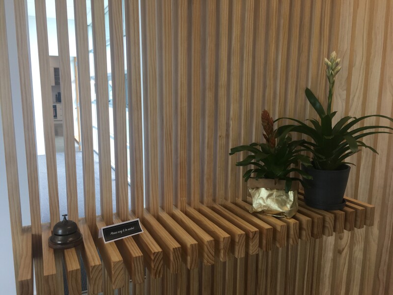
Naturally enough, we spent a long time customising and assessing a pretty neat little iPad based visitor management tool. It was an appealing, simple to use app which even offered sweet integrations with Slack, our office chat/messaging app. However, as nifty as this was, and even though we are a probably more inclined than most to fall in love with cool apps, we decided to experiment with an even simpler form of communication – a $30 “reception” bell from eBay, and a little note to let visitors know what was expected. And it turns out that simplifying the user journey from entrance to stairwell to reception space, and giving them a simple instruction has done the trick. Visitors are now ringing the bell and sitting where we want them until we’re ready for them
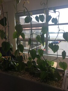
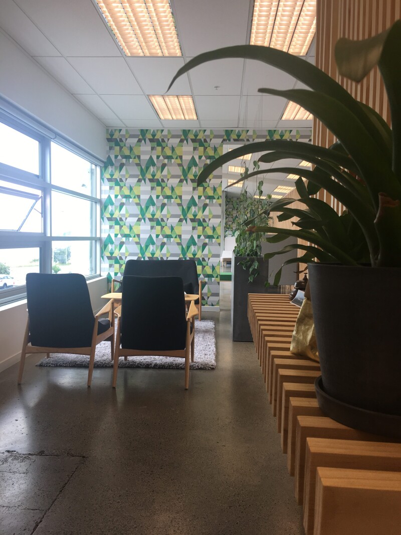
Our Visual Designer Sarah, was tasked with making our (slightly awkwardly proportioned) entrance inviting and practical. She came up with a screen design to match our existing pine slat wall in the gallery, which makes the perfect stopping point without closing down the narrow space too badly. Now, visitors have a clear sense of what to do – press the bell and we will be with you shortly! There’s a lovely waiting space with ocean views and greenery. Plus the screen hides our photocopier/printer mammoth in the corner – a necessary blight on the office landscape.
Sarah notes that the pine slat screen is not only sustainable timber serving a specific purpose, but also pretty beautiful. Raw wood and clean lines give the entry space warmth and structure. Fortunately, she was able to call on her father to build her vision, and Creative Director Andrew to assist with the (rather arduous) task of designing and executing a lightweight wire structure for training the lovely creepers – our cost-effective alternative to the aspirational greenwall we initially wanted.
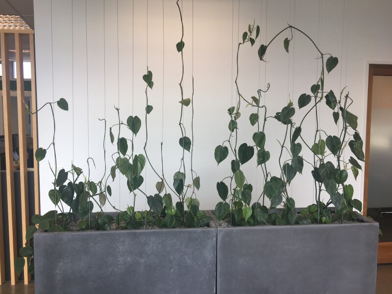
The plants are an architectural feature and a practical tactic for promoting wellbeing.
“Plants en masse improve air quality and enrich the environment,” she says. “It’s really important that the office is an inviting and healthy space to be and functions as a home away from home.”
For every solution we implemented, a lot of research, pricing, discussion and testing went on in the background.
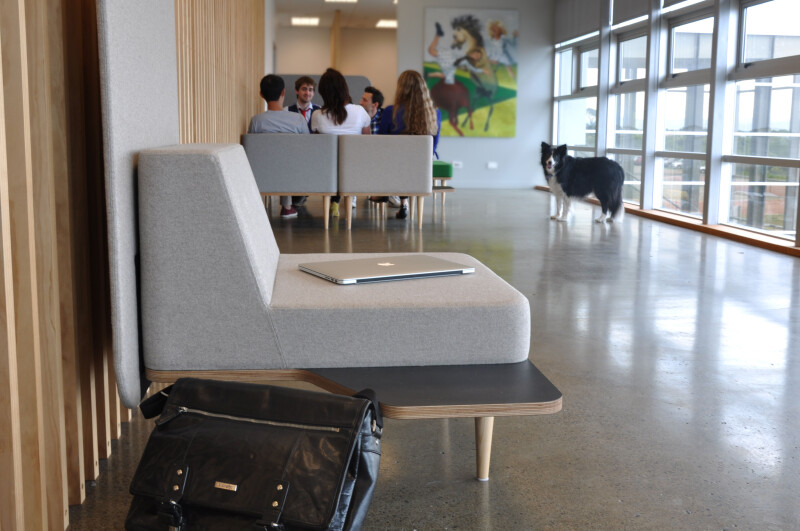
Beyond that, the gallery space is now usable as an additional working area, complete with modular furniture. The key here is being able to reconfigure the seating to fit any meeting or work group. Most days it is set up as a series of private or small-group work spaces – but we can still use the area for social functions and larger workshop events. Plus it looks pretty swanky too..
For now, at least, the office is looking more complete. Continuous improvement is our lifeblood, so I have no doubt we will be looking at more changes down the track. Perhaps by then our needs will have changed? It’s an ongoing discussion that will see the space grow with the company.
Now? All that’s left is to make another coffee, grab a laptop and soak up some inspiration…while ergonomically supported, of course.
- Shout out to Media Suite team members for their contributions to this blog post, both visually and with all the words ?
Banner image: Photo by Chris Abney on Unsplash

