Working as a designer for the past 18 years, I’ve had the privilege of working in a number of different areas from software development, website design, interactive CDROM (RIP), animation and app design. What do all these have in common? They all have an interface between people and product and to be successful, they all require user experience design.
A (Very) Brief History of User Experience Design
Although the term user experience, coined by Don Norman in the 90’s, is relatively recent the study of interaction between people and their environment is far from it.
The art of Feng Shui dating back some 6000 years refers to the spatial arrangement of objects in relation to the flow of energy or chi to create the most optimal, harmonious experience.

From the 1930’s through to the 1970’s, the renowned industrial engineer Henry Dreyfuss was responsible for dramatically improving the look, feel, and usability of dozens of consumer products from some of the most iconic brands like Hoover, John Deere, Western Electric and Polaroid.
His design philosophy was based on applied common sense and scientific principles and resulted in significant contributions to human-factor analysis and consumer research.
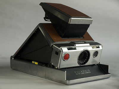
In 1955, Henry wrote Designing for People, in which he said, “When the point of contact between the product and the people becomes a point of friction, then the [designer] has failed. On the other hand, if people are made safer, more comfortable, more eager to purchase, more efficient—or just plain happier—by contact with the product, then the designer has succeeded.” This sums up purpose of user experience design very succinctly.

Back in the digital world, our implementation of user experience design is far more contemporary. With the advent of Web 2.0 in the mid-2000’s, more and more emphasis was put onto the way users interacted with our digital products. We started to pay attention to the way people (or users) felt and how they responded to our interfaces. We started to overlay the concepts and rules used to design our physical objects and apply it to our digital ones.
Where Should You Begin?
In the last few years, there has been a veritable explosion of tools and techniques created to aid us in research, discovery and prototyping designs with the users of our products. To anyone new to the industry, this can quickly feel overwhelming.
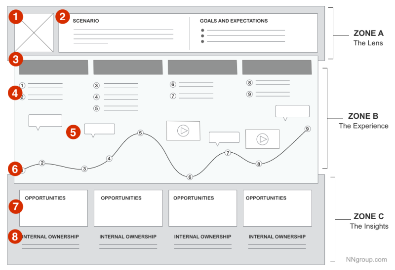
Articles from prominent software development companies and design agencies evangelising their techniques and ceremonies can have you being pulled in different directions.
The truth is, all techniques can be distilled back to a few simple core ideas. These companies have taken these ideas and developed them into something that fits their organisations structure and needs. Not all these techniques will work for you, and that’s ok.
User experience design is a simple cycle: User research, ideation, prototyping, testing with users. Rinse and repeat.
You may find yourself working within an organisation that traditionally has not put an emphasis on user research and user experience. Thrusting an unwitting group of colleagues into a Crazy Eight ideation session may go down like a lead balloon – causing said colleagues to look dubiously upon this user experience design concept you speak so passionately of.
Keep It Simple
Find a product requiring better user experience. It generally helps if this is a new project not caught up in the bureaucracy of existing stakeholder engagement, time and budget restraints. Find a project with a clear goal, for example, “to make it easier and more intuitive for users to use a particular feature”.
Start Small
When dealing with an organisation that isn’t well versed in the practice of user experience design, they may look upon this as a “nice to have” or “something we can look at further down the track”. The truth is, user research conducted right at the start of a project can pay dividends in the long run, providing essential insights, saving unnecessary refactoring of features, and a reduction in customer support budgets. This is often the best way of selling UX to a client or product owner as they will understand the benefit of savings costs in these areas. Try starting with a small, well-defined statement of work which could include:
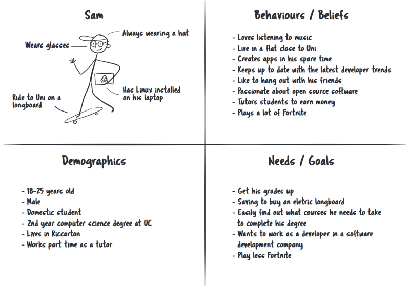
- Conducting some user research: This could be as simple as observing people try to use an existing feature, noting down pain points and asking specific questions that will allow you to generate personas
- Producing a set of key personas: If it is not possible to obtain enough information about the users to properly develop personas, then proto-personas can be created and validated later.
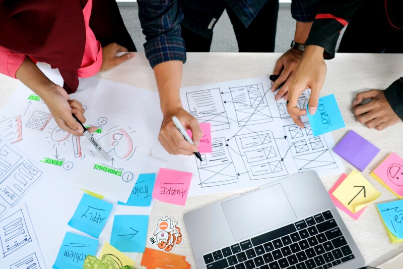
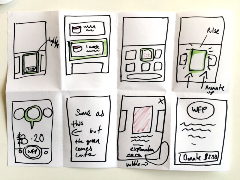
- Creating an interactive prototype of a new feature: This can be as simple as different screens or visuals printed on a piece of paper, or using an interactive prototype tool like inVision. You don’t need to invest a lot of time into making these look amazing if you’re simply testing a workflow. A set of wireframes will suffice.
- Running a small user testing session to validate the prototype: You don’t need to run the same prototype passed a whole bunch of users. Between 3 and 5 is probably a good amount to aim for. Any more and the amount of insights to be gained quickly diminishes.
- Designing a few key high fidelity designs of the feature / product: Based on the results of your user testing, you should now have a good idea if your prototype will work. You can now back up your designs with this evidence.
One or two people should be able to conduct this first piece of work keeping your spend to a minimum. Keeping the scope small also makes it low risk and allows you to gain trust and produce valuable outputs quickly.
Meshing Visual Design and UX Together
As a designer, I’m constantly wanting to push the boundaries of the interfaces I create. I’m also very aware that some of my creations may not necessarily hit the mark when tested with users. Often those working within the UX field will consistently fall back on the tried and true patterns and concepts as they know they will have been thoroughly tested and accepted as best practice. If you’re not careful, this can lead to overly homogeneous interfaces. It is ok to try new and innovative designs patterns as long as you always keep the user in mind. If you’re unsure if something will work, test it! If your users understand how to interact with the new pattern intuitively and they can accomplish their task easily, then you have success.
It is so important that we keep challenging our understanding of our users. Technology is constantly evolving and improving, therefore the way our users interact with that technology is constantly changing. User experience design lives at the heart of these interactions and the best toolset we have to make sure we always Build the Right Thing.
Banner image: Photo by UX Indonesia on Unsplash

