Most design discussions online revolve around consumer apps. Clean onboarding, polished animations, and minimal screens get the attention because consumer apps operate in a crowded, optional environment. Users are distracted, impatient, and free to abandon an experience at any moment. These patterns help reduce friction, create emotional appeal, and quickly communicate value.
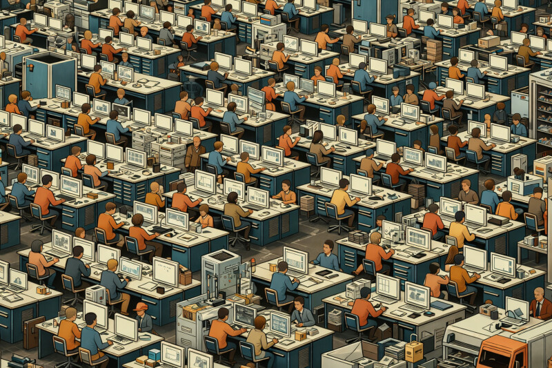
Enterprise and bespoke software live in a different world. It is shaped by internal workflows, specialised user roles, legacy systems, and constant operational pressure. Attention is not won once, it is sustained over hours of repeated use.
People depend on these tools to do real work accurately and efficiently. The stakes are higher, and the problems are more complex.
This article looks at what actually matters in enterprise software UI design, when ideas meet real users, real data, and real delivery constraints.
The Efficiency and Accessibility Tension
People who use enterprise systems are staff, coordinators, analysts, inspectors, and operators. They know their workflows deeply and repeat the same tasks many times a day. A logistics coordinator checking live loads every few minutes works very differently from someone browsing a consumer app.
For these users, splitting workflows across multiple screens or adding extra steps creates friction, even if the interface looks tidier.
At the same time, these tools must remain accessible. They need to support people who rely on larger text, clearer structure, or assistive technology. The goal is not to choose one group over another. It is to design flexibility that supports both speed and clarity.
Tables are a good example of how this tension appears in practice.
A design might begin with five neat columns, short labels, and tidy one-line values. Everything aligns beautifully, and the layout feels balanced. The table component is built, and you get the first glimpse of the test environment.
Then reality arrives.
The Customer Name field contains full legal names that stretch across the screen. The Status column includes long operational phrases because the business has never standardised them. The Notes column holds entire paragraphs because people use it to work around system gaps. IDs vary in length. Some rows contain blank values. Others include unexpected characters from old imports.
In moments, the elegant table becomes a wall of wrapping text. Rows grow unpredictably. Columns fight for space. Horizontal scrolling becomes constant. Users lose the ability to scan patterns because the structure they relied on has collapsed.
Nothing is wrong with the design itself. It simply reflected assumptions that did not match the reality of the data.
This is why interfaces should be tested with realistic data as early as possible. Clean sample values create a false sense of clarity. Real data exposes the true constraints you have to design for.
When accessibility needs are layered on top of this, the complexity increases again. Larger text, higher zoom levels, and additional spacing must not cause the interface to break. Flexibility becomes part of the design rather than an afterthought.
These tensions are normal in enterprise design. The challenge is not to eliminate them, but to recognise them early and create patterns that hold up under real conditions.
The Standards and Customisation Tension
Enterprise teams building internal tools, bespoke platforms, or large-scale B2B products depend on stability. Components that are reused across teams and products, patterns that teams already understand, and code that developers can maintain without constant reinvention.
Custom components can feel satisfying to design, but they often come with hidden costs.
The Hidden Cost of Custom UI Components
We once created a custom date picker that matched the brand perfectly and solved a few edge cases. It worked beautifully in Figma.
Implementation was a different story.
Making it accessible required text input support, keyboard behaviour, focus states, error handling, and screen reader cues. Development complexity grew quickly. We eventually realised the component was becoming far too complex for the value it provided.
By reverting to a couple of standard off-the-shelf components, we avoided accessibility issues and removed a significant amount of unnecessary complexity.
The lesson was not that custom work is a bad idea. It is that custom work must be carefully justified. Always look at what already exists before designing something new.
How Developers Improve Enterprise UX Design
One of the most important shifts in my own practice was treating developers as design partners rather than recipients of finished work.
A good example came from a data entry workflow where users scanned barcodes to move through records. The process still required mouse and keyboard interaction to shift focus and advance to the next item. I had streamlined the navigation as much as I could within those constraints.
When I walked through the design with a developer, they pointed out that barcode scanners behave like very fast text input devices. The system could detect a scan and automatically move to the next record.
This removed an entire mouse and keyboard interaction, saving time in a way I had not previously considered.
Developers bring a different understanding of constraints and possibilities. Many of the best UX decisions emerge from that collaboration.
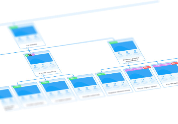
Design Systems Should Grow From Real Use, Not Ambition
It is tempting to launch straight into building a design system. The strongest systems, however, grow slowly from real product work.
They usually begin with foundations. Typography, colour decisions, spacing, tone, and a small set of guiding principles. These create cohesion without imposing rigid rules too early.
Components emerge over time. When a team needs a table, form, modal, input, or layout pattern, that becomes the opportunity to refine or formalise it. If engineering already relies on a stable component from an existing library, that is the natural starting point.
A simple habit helps here. When the need for a new component appears, always look at what already exists first. Reusing proven patterns keeps the system smaller, easier to maintain, and cheaper to evolve.
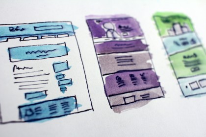
Another important consideration is where the source of truth should live. Does it belong in Figma, or in the coded component library where props, behaviour, and documentation live together?
It is easy to build a fully fleshed out design system in Figma, complete with every variation beautifully presented. But it is worth asking who that work is really for.
Once components are built and used in production, Figma artifacts can fall out of sync quickly. Maintaining both the design version and the coded version doubles the workload and creates confusion about which one is authoritative.
In most cases, the source of truth should be the coded component library. Figma remains essential for exploration and communication, but living components should guide the system.
Strong systems help, but they cannot compensate when a design vision outpaces what the platform can realistically support.
The Vision and Reality Tension
Some designs work perfectly in prototypes and fall apart as soon as they meet technical reality.
When UX design outpaces technical reality
I worked on a project exploring advanced mapping behaviour. Multi-layer visibility, multiple drawing modes, custom tools, and flexible interactions. The prototypes were exciting.
Once investigated, the underlying technology could not support these behaviours at the required level. The engineering effort would have exceeded the project scope and still produced something fragile.
By simplifying the workflow to one focused action at a time, the feature became more predictable, easier to use, and far more stable.
Ambition is not the problem. The problem is when the vision for a feature outpaces what the platform can realistically support and maintain.
A simple way to surface these gaps earlier is to test designs in the conditions they will actually be used. That means working with real data, real input methods, and real technical constraints as soon as possible. Clicking through a Figma prototype is not the same as scanning barcodes, navigating with a keyboard, or working against a live API. The closer testing gets to real usage, the faster false assumptions are exposed.
What Actually Matters in Enterprise UX
Enterprise design is not about producing the most visually impressive interface. It is about designing tools that support real work under real constraints.
It matters when designers get close to actual workflows early. It matters when clarity outranks novelty. It matters when teams start with proven patterns and customise only when there is genuine value. It matters when designers and developers shape solutions together.
Above all, it matters whether the design holds up when it meets real data and real users.
This kind of work is rarely flashy, but it has impact. It reduces errors. It speeds up complex tasks. It gives organisations tools they can rely on every day.
That is the work that counts.


