What is INP and Why It's Redefining Web Performance
Some of the fastest products in the world don't feel fast. And some of the slowest ones somehow do.
That’s the magic (and mischief) of perception, the part of UX where milliseconds meet psychology.
Google’s new Interaction to Next Paint (INP) metric lives right in that space: the micro-moments where an interface either feels instant or leaves you wondering if it’s broken.
It’s not about how quickly a page loads, but how quickly it responds, that heartbeat between a user’s tap and the first visual sign that the system heard them. And that tiny gap, barely measurable but instantly felt, is quietly redefining what we mean by “good UX performance.”
The Shift from Load Time to Feel Time
For years, we’ve obsessed over how fast things load. First Contentful Paint, Largest Contentful Paint, metrics that measure how quickly something appears. But INP moves the goalpost.
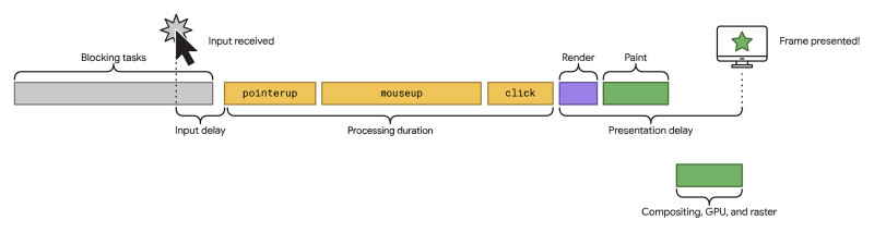
Instead of focusing on what happens before interaction, it looks at what happens after, when someone clicks, taps, or types. How long does it take for something to visibly respond? That’s your INP.
Google calls it “the single best indicator of a user’s overall experience of responsiveness.”
If your app takes more than about 200 milliseconds to visually respond, people start to feel lag, even if everything else is lightning fast.
The interesting part is, INP isn’t just about speed. It’s about psychology: how the brain interprets responsiveness, and how design can trick, smooth, or amplify that feeling.
Web.dev: What is an interaction
Why We Notice Delay More Than Speed
Human-computer interaction research has shown for decades that our perception of delay follows an emotional curve. A 100 millisecond delay feels instantaneous. Around 300 ms, we start to notice. Past a second, our minds wander. By ten seconds, we’ve mentally left the building.
Research from the Nielsen Norman Group suggests that even small delays can disrupt the user's sense of flow and increase the mental effort required to stay engaged.
What’s fascinating is that perceived delay often matters more than the real one. Users forgive slowness when they feel acknowledged. They’ll tolerate longer waits if the interface communicates that something’s happening, or better yet, seems to start responding instantly, even if the full result takes a bit longer.
This is where design comes in.
Designing the Feeling of Speed
Here’s the truth: INP isn’t only a developer metric. It’s a design opportunity.
Every interaction is a tiny moment of trust. You click, tap, drag, and the interface either says “I’m listening” or it leaves you hanging. Great interfaces choreograph these micro-moments so that responsiveness feels human, not mechanical.
Below are a few design patterns that help.
1. Show a Skeleton, Not a Spinner
Spinners tell users, “wait.” Skeletons say, “look, we’re building.”
A study by Luke Wroblewski showed that users perceive skeleton screens as loading faster than spinners, even when the actual load times are identical. The reason: skeletons set visual expectations.
For designers, this means:
- Sketch simplified versions of your UI states before data arrives.
Keep the shapes recognisable so users connect them instantly to what’s coming.
It’s not fake speed. It’s felt speed.
Luke Wroblewski: Skeleton screen loading progression
2. Use Optimistic UI
Ever notice how Twitter lets you “like” a post and turns the heart red immediately, even before the server confirms? That’s an optimistic UI, one that assumes success and corrects itself only if something fails.
It works because it respects the user’s intent. The click or tap feels immediate, even though the confirmation happens later.
The key is designing for graceful error states. If that “like” doesn’t go through, the interface should quietly reverse and explain, not punish.
When I’ve tested this in product flows, users describe it as “snappy” or “smooth,” even when backend times haven’t changed at all.

3. Stage Motion with Purpose
Micro-interactions and subtle motion cues do something powerful for INP: they buy attention time.
A 150 millisecond fade or scale animation signals that the system has heard you. It also smooths transitions between UI states, masking the mechanical jumps that make apps feel clunky.
But there’s a fine line. Too much animation can add delay. The sweet spot is motion that begins within 100 ms and helps continuity rather than decoration.
Think of motion as a language of empathy. It reassures without shouting.
4. Prioritise Visible Feedback Over Hidden Processing
Imagine a complex enterprise dashboard where an “Export Data” button appears slow, even though the download begins instantly. Without any visible progress indicator, users might assume nothing is happening.
If a subtle progress bar and confirmation toast appeared instead, users would likely perceive the experience as smoother and more responsive, even if the underlying speed stayed the same.
Visibility is responsiveness. Users don’t need instant results, they need proof of life.
5. Design for the 'Next Paint' Moment
The “Next Paint” in INP literally means: when the next frame appears after user input.
So if someone taps a button, your layout shouldn’t shift unexpectedly or wait for heavy scripts before responding. Even a small hover effect, pressed state, or immediate visual feedback counts as a paint.
In practice:
- Keep input handlers lightweight.
- Use transitions instead of blocking actions.
- Make sure something on-screen changes immediately after input, colour, shape, shadow, anything that signals “heard you.”
The goal isn’t instant completion. It’s instant acknowledgement.
The Empathy Layer of Performance
When we talk about performance, we often drift into numbers, milliseconds, scores, audits. But those numbers represent something deeply human: patience.
Every delay taxes a user’s cognitive bandwidth. Every micro-acknowledgement earns a little trust back.
Responsiveness isn’t just a technical metric, it’s an emotional contract. It says, “I’m listening, and your time matters.”
The Google UX research team even notes that users tend to remember slow experiences more vividly than fast ones, a kind of negative “performance memory.” The first sluggish interaction colours their perception of the whole product.
So designing for INP isn’t about chasing a green badge. It’s about protecting the relationship between user and interface.
From Metrics to Meaning: Designing Responsiveness That Feels Human
Performance metrics will keep evolving, from INP to whatever comes next. But the underlying goal won’t change: to make digital experiences feel as responsive as human conversation.
Think of it this way. When someone talks to you, they don’t expect an instant answer. They expect a sign you’re listening, eye contact, a nod, a small gesture that bridges the gap.
Design works the same way. Every interaction is a micro-conversation between a person and a product. INP just gives us the vocabulary to measure how well we’re listening.
So yes, check your Core Web Vitals. Optimise your handlers and animations. But also step back and ask the bigger question:
Does it feel instant?
Because the most responsive interfaces aren’t just fast. They’re considerate. They respect attention, reward patience, and quietly remind us that good design, like good conversation, is all about response.
And that’s something worth keeping in the green.