Dealing with complex user experience challenges in one domain can really put the blinders on.
You tend to run down the rabbit hole, learning and analysing the context of the end user so you can champion their needs.
But if you’re not careful, it can become a silo. It’s good to come up for air every once in a while, look at the UX challenges of other industries, and gain some perspective that might provide inspiration for the problems you are trying to solve as a user experience professional.
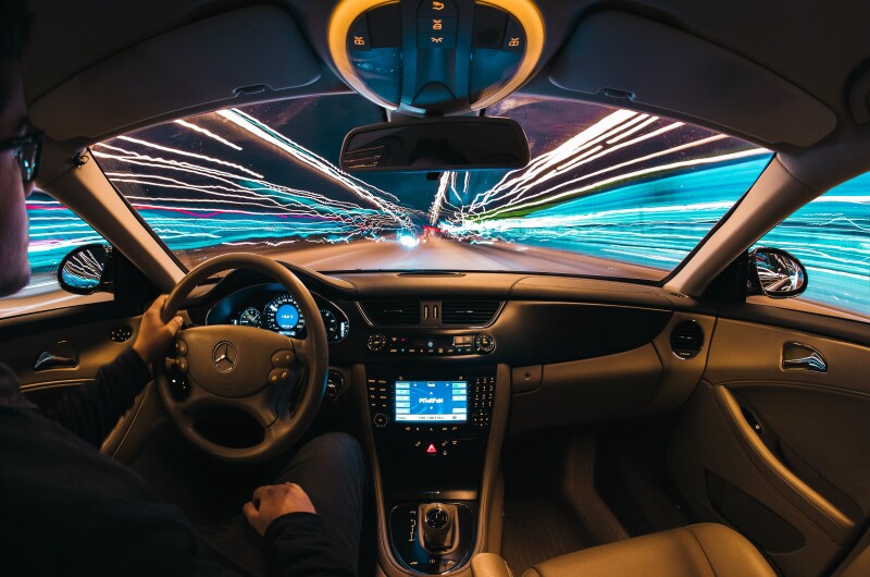
And in that regard, one of the best places you can look is the screen in the dash of your car.
This seemingly simple, industry-dominating device is actually a nesting doll of UX challenges. Once you dig in, it’s difficult to look away.
The journey to get to today’s digital screens has been long, complex, and divisive. Aston Martin debuted the first digital in-car screen in the late 70s, and since then innovators have typically been punished with bad press and negative feedback until their devices have been iterated and refined.
And a question mark still hangs over the effectiveness of screens even though they are used in 97% of new cars.
The headline of 2023’s JD Power Vehicle Dependability Study, for example, was Technology Continues to Frustrate Consumers. The survey highlights the struggles car owners have with infotainment technology, with 49.9 problems per 100 vehicles reported just in this area of car design.
Perhaps it's forgivable then to find many car manufacturers performing mental gymnastics.
Some of the world’s biggest brands seem stuck between needing to compete in the touchscreen arms race while still not entirely embracing screens and all the negative associations that come with them.
Take the 2023 Consumer Electronics Show (CES) in Las Vegas.
Kai Langer, head of design for BMW i, told the New York Times: “None of our consumers would want to cover their living room in screens. They want their Eames chair or Nelson clock. And we want our customers to feel at home. A touch screen doesn’t speak to our senses. We’re made to touch fabrics and sense different surfaces; that’s what makes us human.”
An interesting statement, given that BMW used the event to debut the BMW i Vision Dee, a concept with a full-screen heads-up-display (HUD) with augmented reality across the windscreen.
If you think about it, by taking over the entire windscreen BMW can say the concept avoids using a screen at all. Very clever, if you know consumers want a screen-like solution but struggle to use them. When is a screen not a screen? When it's the windscreen.
For me, this epitomises where the automotive industry is at. You may have a love-hate relationship with your in-car touchscreen, but so does the industry that makes them.
With all that in mind, if you opened the hood on the UX challenges of “automotive infotainment user interfaces”, what would you find? Here are my top three take-aways after going down that rabbit hole.
1. Map the user journey around your digital product
One of the nesting doll qualities of infotainment screen UX is its relationship to devices outside the car. If you peel away the outer layer of the onion and descend, Inception-like into the motivations and market movements that led to that screen being in the centre console of your car in the first place, you’ll find yourself staring at an iPhone, not any innovation that’s actually been delivered inside a car.
When the average American checks their phone 144 times a day, it’s perhaps not surprising to learn that Apple CarPlay and Android Auto are so influential that they have the capability to negate the negative experience caused by a poorly-rated, overly-complex infotainment system offered by a car-maker.
Many car manufacturers are stuck between going the OEM (original equipment manufacturer) route - so they can market a bespoke infotainment system as a USP (unique selling point) - or joining the ranks that at least partially outsource the problem to Apple and Google.
General Motors is one recent example, having just pivoted its strategy away from Apple and Android systems.
Key UX take-away
Acknowledge the entire user journey, including the time given to competing devices before and after your platform or device is used. We live in an attention economy with the iPhone as perhaps the most influential teacher of learned habitual behaviour this century. To ignore an influence this big has become the central conundrum of automotive infotainment design.
The UX problem you’re facing may not have an outside influence as powerful as this, and you could argue that acknowledging such an influence will lead you down a less original path. But it’s still important to get a sense of the other systems your user group might know like the back of their hands, and how this sets their expectations and influences their ways of working.
2. Segment users and recognise context when prototyping
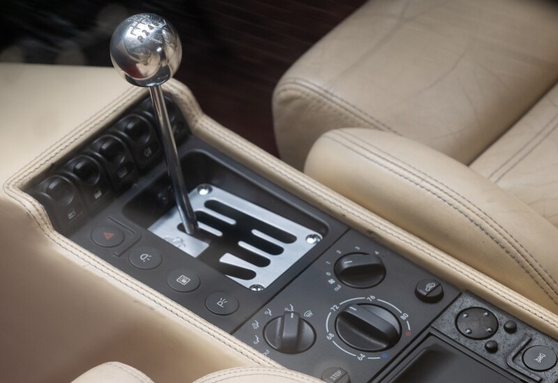
The way the automotive industry sometimes talks about screens could lead you to believe that there’s still an open question on whether they are safer than haptic touchpoints in the car.
But the funny thing is, that question has already been answered. And in typical fashion, it was the Swedes who did it in a test involving an old Volvo.
In 2022, Swedish automotive magazine Vi Bilägare tested how long it took to carry out a series of four actions while driving, in a comparison pitting 12 modern cars that use an infotainment touchscreen against a 2005 Volvo.
It took 10 seconds to complete the four tasks when driving the Volvo, while the longest time recorded in one of the modern vehicles was 45 seconds.
Case closed, right? Every new car should now do away with their infotainment screens, correct?
Unfortunately, it's not that simple. If a haptic device is quicker to use, that's influenced by habitually learned behaviour. For example, when a car-maker breaks from convention and places a touchpoint in an unintuitive place, that can add time to complete the action.
In 2020, Consumer Reports said of the Tesla Model 3’s infotainment screen interface: "In most cars, it's intuitive to feel around for those controls without taking your eyes off the road. But on the Model 3, these simple tasks must be done through multiple steps on the touch screen."
Placing a haptic touchpoint in the wrong place happens less often now screens have taken over, but think of the way right-hand-drive models often have the bonnet release lever hidden somewhere in the passenger side of the cabin (where the driver sits in left-hand-drive markets).
In an era when 97% of new cars use touchscreens, the opportunity for future drivers to learn that speed of action on a haptic touchpoint could also be reduced as today’s cars filter through to the second hand market.
In essence, haptic touchpoints might be safer, but possibly only for certain drivers and only for a certain time.
Key UX take-away
Recognise the context of qualitative test responses.
The reality is that focus groups do not happen enough in the real world, especially on smaller projects with less budget and in startups where the principle is often to test in-market and rapidly iterate with real products.
But if you do gather test data through prototyping a design, don’t look at the quotations from testers in isolation. Try to build a focus group around segmentation that categorises testers into segments in which feedback can be correlated back to different traits and demographics.
Personally, I’d love to see that Swedish test run again but this time with Gen Z drivers in the mix.
3. Fight hard to maintain market orientation
Sometimes we can get too close to our product and lose perspective. It’s actually a very human response that afflicts professions like marketing and product development.
Innovators are particularly prone to this when trying to disrupt highly commoditized markets. They fall in love with the features and benefits they want to champion, and denigrate the competition for being too price-led - not realising that the end user is shopping on price in the first place.
This is known as having a lack of market orientation, and like many sectors, it looks like the automotive industry can fall into this trap.
When consumer preferences are compared to those of industry experts, you see very different attitudes about in-car touchscreens. Consumers prioritise Apple and Android integration over an OEM infotainment system, while the industry prioritises their own systems.
If you’re looking for a reason for all the competing systems you face in the modern car, the lack of market orientation is a compelling one.
People want their phones in their car, but by handing control of infotainment to one of the two big smartphone systems, car manufacturers lose the opportunity to offer an original innovation as a USP.
Key UX take-away
Never lose market orientation and do your best to keep a profound, empathetic view on what the end user wants and needs.
It’s a slippery slope and a surprisingly common problem.
Although my research for this article has purely been of the desktop variety, there is more than enough compelling evidence out there that points to car owners not wanting to think about their infotainment systems. Which surely benefits safety, if manufacturers can provide them with systems that are intuitive from learned behaviour outside the car.
In other words, consumers know how to navigate their phones and just want that same experience in their cars.
This begs the question whether an OEM infotainment system can even be seen as a USP in the eyes of many consumers.
Luxury brands like BMW and Mercedes-Benz should be acting on data showing their segments think differently. But if not, many of their innovations could prove to be more flash-in-the-pans that contribute to the kind of bad consumer experiences recorded in JD Power surveys.
*Tim Grey is an analyst and marketer at MadeCurious, and a former member of the New Zealand Motoring Writers’ Guild.