Graphic designers are encouraged to tell stories with their designs which take the viewer beyond the surface and resonates more deeply with them.
However, in practice what does this actually mean, and how does this manifest in the graphic and design process?
Storytelling in literature takes the form of narrative where the reader journeys through exposition, conflict, rising action and denouement. Looking more broadly at the field of visual design you can easily see the parallels between creating narratives with character and creating scenarios and personas. A key reference point in literature on this subject is Greek philosopher Aristotle’s writings on persuasion.
The Interaction Design Foundation outlines in the list below how Aristotle’s seven elements of good storytelling can be applied to planning a project.
- Plot – what are users trying to achieve/overcome?
- Character – who are the users: not just demographically, but what insights do you require to understand what they’re truly like and their real needs?
- Theme – how can you establish a trustworthy presence to them and still set yourself apart from competitors? How do you reflect the overall obstacles users must overcome?
- Diction – what will your design say to users and how? Does a formal/informal tone match what they’d expect to find? How much text is appropriate?
- Melody – will the overall design pattern appear pleasant and predictable to users, moving them emotionally?
- Décor – how will you present everything so the graphics match the setting the users can sense? Is a classic design or a stylised, niche layout in step with their expectations?
- Spectacle – how can you make your design outstanding so users will remember it?
The creation of personas, scenarios and other foundational details are there to help map out and gain an understanding of the user, not to communicate directly with them. After all, understanding the people who are engaging with your work and knowing the context in which your work is created is key to good design. A successful piece of design anticipates and leverages off the common experiences of the people engaging with the work.
If you have ever created a persona you will understand how challenging the character development process is. It’s easy to overreach and for the personas to become cliched or overly simplistic. In these internally facing documents, the risks are outweighed by the benefits. However, for externally facing designs, showing these characters who explicitly represent the people engaging with the design may not be the best approach.
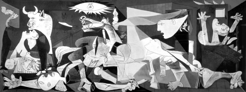
When it comes to narratives, they can also be less than useful when you don’t specifically need to take the viewer on a journey through exposition, conflict, rising action and denouement. The power of visual narrative can be seen in Picasso’s Guernica, but may not be right if the intention is for your viewer to simply feel hassle free and relaxed when browsing a spa treatment brochure.
Most graphic design doesn’t follow a narrative but tells a story all the same. There seems to be some confusion surrounding this, and it is sometimes implied that all designs are narratives. The Interaction design foundation for example states on its website:
The narratives in your stories are “magic mirrors”—representing your fine-tuned empathy and connecting with users’ values—in which users discover how to make their own happy endings.
Perhaps it should read:
The designs behind your stories are “magic mirrors”—representing your fine-tuned empathy and connecting with users’ values.
The second half of the sentence;
—in which users discover how to make their own happy endings.
Seems to be referring to the open-ended nature of design stories and their power to enable the viewer draw their own conclusions. When phrased as above, however, it makes it sound like the viewer is at the end of a narrative or story arc when encountering your work.
Storytelling in design often takes a different form and requires a different approach. Jessie Weaver in his article What is storytelling in design in Medium writes:
“In design story is all about emotion. Our goal is not to build character and plot it is to convey and elicit feelings. This can fold into your design practice through clarity, understanding and intention. If you are clear on the emotions you are trying to drive, understand the people who engage with your work and are intentional with your approach the story writes itself”
He goes on to say:
“However, this doesn’t mean that we aren’t storytellers. But, foundationally, I think we are zeroing in on the wrong aspect of what makes a good story. A narrative structure is just a mechanism, the how, it is not the end result.”
This approach appeals to me. It can be applied to most graphic design tasks and allows you to measure the success of a design. It reframes the notion of storytelling in design to provide clarity of approach, enabling the designer the freedom to choose the most suited visual devices for the job at hand.

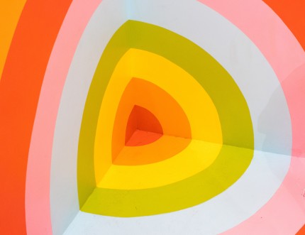
These devices can range from basic principles such as shape, colour, value, form, texture and space, through to other principles and strategies, hierarchy, composition, gestalt principles, typographical conventions and also many literary devices that translate to visual design. These literary/visual devices can communicate complex ideas quickly, emote and add humour such as double entendre, allegory, and satire and metaphor. We learn about the world through metaphors and experience, this is how we derive meaning and predict outcomes. Unlikely metaphors can engage, bring delight and humour. Key metaphors make a concept easily memorable and relatable. The key is to use them in moderation.

Visual elements can be absorbed and retained quickly, adding clarity to written or spoken narratives. However, visuals on their own, as I mentioned earlier, have the advantage of being an open-ended form of communication. This allows the people engaging with the work, to connect the dots, or feel they are drawing their own conclusions. It encourages them to create their own story around the product or design experience, which is more likely to resonate with the viewer, be remembered and shared. Some of the most clever uses of narratives in visual design are merely implied.

The Interaction design foundation sums it up nicely when they state “Ultimately your design should show you’ve used storytelling to predict your target users actions at every level possible” in order to intentionally elicit the desired emotions and perceptions. The response is a clear measurable outcome. Design stories have their own attributes and strengths, and along with written and verbal stories, can help us convey legends.