Designing a new website for yourself is challenging. You’re the client, and probably the most difficult one. You want to represent your brand in the best possible way. You want to stand out and differentiate yourself.
Arrgggghhhh, the pressure!
Yeah, designing a new website is challenging, but doing that alongside a re-brand takes serious planning and careful consideration.
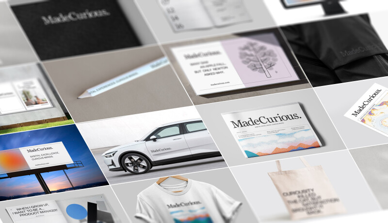
MadeCurious may be a new brand with a new website but it's built on a company with over 20 years of experience. In itself a statement, MadeCurious is a distillation of who we are and what drives us - and the result of a collaboration with local design agency Studio Pask.
Our name is a reflection of our unique selling proposition. Our people. More specifically the culture and mindset of our people. We are curious by nature and bring that ethos to everything we do. We love a good challenge and aren’t afraid to get stuck in boots-and-all into some of the most complex problems both here in Aotearoa and beyond.
With the perfectly austere colour palette of black and white and the use of classic typefaces like Georgia and Founders Grotesk, it has a timeless quality to it and a subtle nod to our old brand. Not trying to jump on the next trend, the brand steps back to showcase what’s really important - our work, and our people.
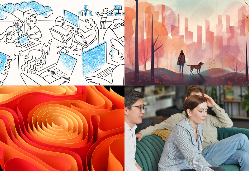
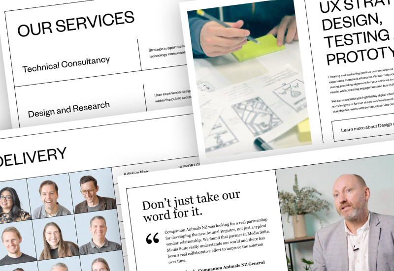
With a distinctly editorial feel, the brand is not tied to any one type of imagery. This allows freedom to experiment with different illustration styles and photography changing the feel of the brand depending on the context. The grainy overlay across all the images on the site ties everything together creating a softer, more hand-crafted aesthetic.
And now we get to the other part of the challenge. Designing and building a website that not only encompasses the brand but extends it into the digital space.
Maintenance and Flexibility
One of the main goals was to make a website that is easily maintainable. This means making it simple and flexible enough for anyone in the team to jump in and make changes from small tweaks to complete new pages. It would be very easy for us to have created a bunch of custom templates and layouts for each of the sections and pages within our site, but we wanted ‘practice what we preached’ and create a completely component-based site.
With careful planning, we were able to create a small number of component blocks with slight variations in layout and features. This has a couple of advantages.
From a flexibility perspective, this allows anyone editing the site to create the pages they way they want, rearrange content, and create both short and long form content. And by using the variations and feature options within each component, we can easily tweak the layout to create subtle variations to each of the pages.
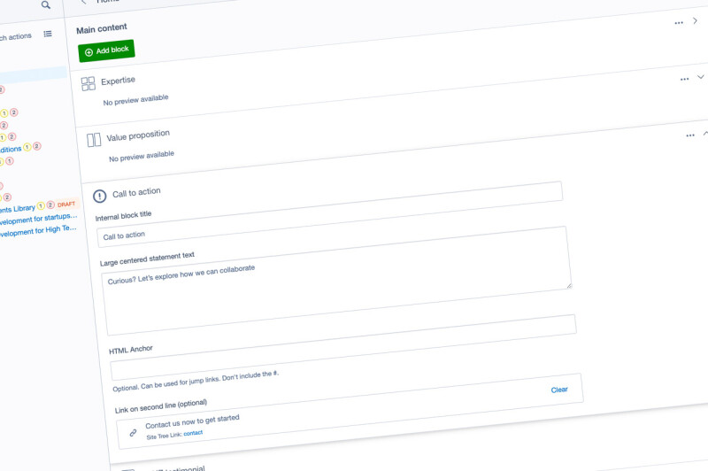
From a development and maintenance perspective, creating component-based layouts can be a massive win. Economising on the components means a faster build and less code to maintain. It also makes for a shallower learning curve for anyone editing the site.
Win win!
Design and Accessibility
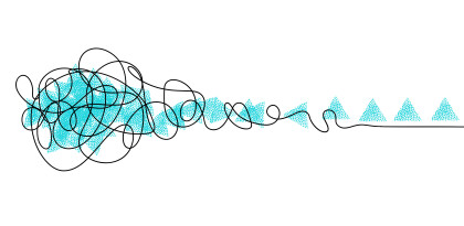
For the keen-eyed observers, you will have noticed there are very few visual elements making up each page. One of the challenges working with the brand was creating engaging layouts and components (which all required to work with dynamic content) with only 2px black lines and text. This style, reminiscent of the “Swiss Style” exemplified by twentieth-century designer like Josef Müller-Brockmann, use lines to expose the underlying grid. This technique provides structure and form within each of the pages, and with subtle use of broken incomplete borders in places, creates diversity and interest within the simple elements.
I wanted a design that would embrace screen resolutions of all sizes without overwhelming users of large high-resolution screens, or becoming an inconvenience for those on smaller screens. Ensuring ample space between sections within the page provides breathing room and clear differentiation between topics within the content. Sections within the page expand to fill the space ensuring the users only need to focus on one section at a time. There is no need to get stuck in the “above the fold” mentality as designer Chuck Pearson expertly dismantles through research in his article “The above the fold” myth”. This design isn’t afraid to embrace the scroll.
An important aspect of extending the brand into the digital space is creating motion and interaction. I wanted elements on the page to come alive when interacting with the UI. High contrast focus states and full tile background images juxtapose the default states encouraging users to explore the various sections and elements on the page.
With our strong focus on accessibility, designing a site that lives in harmony with the WCAG 2.1 guidelines is also crucial. The use of large high contrast text elements, clear consistent navigation and careful inclusion of subtle motion mean we are able to create a website that is inclusive and engaging without the need to offer separate high contrast and low motion functions. Hot tip - look out for the next instalment to hear in more detail how we approached accessibility within development.
For long form content pages, I wanted to create an alternate viewing experience to enhance readability. The Georgia typeface, designed by Matthew Carter in 1993, was chosen for the body text. In collaboration with Microsoft, this font was specifically designed to improve readability on screen and remains one of the most accessible fonts today.
The key design decisions that went into ensuring the content was accessible and easy to read were:
- Using a serif font (Georgia) - serif fonts have greater variation between glyphs making it easier to distinguish between letters, e.g. l and I.
- Increasing font size to 20px for the body text to make it easier to see for low-vision users
- Increasing line height/leading to aid with tracking between lines
- Ensuring we set a max width for paragraphs of around 100 characters including spaces to also aid with tracking.
- Keeping images and text vertically inline and not overly complicating the layout
- Adding clear captions to photos to provide context
- Setting high contrast text against the background colour.
- Adding help metadata to the top of each of these pages provide useful context for users before committing to reading the full content.
What do we want our users to do?
So we’ve captured the attention of our users and they’re primed for the next step. What is the best way to capture that lead? Should we be using forms, chatbots or just putting in plain old email addresses? That was a rabbit hole we dived into which led us to an excellent article by the CEO of Studio Yellow Birgitta Rún Sveinbjörnsdóttir - Are people still using contact forms? — a UX research case study.
Brigitta clearly lays out the pros and cons of of each method providing rationale for when and where to use them. Ultimately, we decided to try multiple methods and measure their effectiveness over time.
By using large statement blocks in Georgia font at key locations within pages, we can be explicit about what we want them to do and where to go to do it. For our whitepapers, we include simple sign up forms for capturing key information about our users. And for those who are looking for a plain ol’ email address or phone number, we have them too.
One area we are investigating is the use of AI LLM (Large Language Model) driven chat services. The HubSpot research referenced in Birgitta’s article report 71% of people use chatbots to solve their problem fast. 56% of people would rather message than call customer service and 53% of people are more likely to shop with businesses they can message.
This suggests there is a good proportion of users who like to use a chatbot to find out more about a service before engaging with real people.
That’s well worth a look.
If you’ve made it this far, it could mean that you get as excited about design as we do. You might be inquisitive about how we’ve approached this project from an accessibility perspective. Maybe you’re just interested to know what we’ve been up to.
Whatever the reason, we hope we’ve made you curious.
